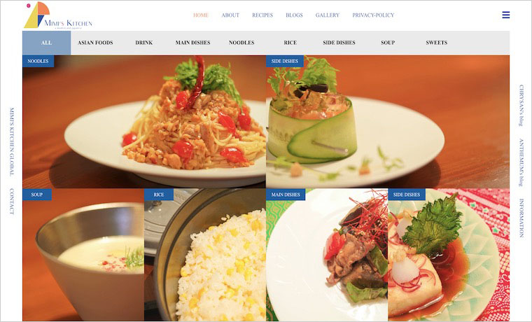
Name: MIMI’S KITCHEN
Theme: NUMERO
Kind of business: Recipe Gallery Site.
Comment:
With the theme of Japanese food, we introduce Japanese recipes that are easy for anyone to make, a little bit fancy, and delicious.
We are trying our best to research the recipes in order to make the visitors interested in Japanese food as much as possible.
Making the most of the advantages of NUMERO, I am making a page with the awareness of “presenting photos beautifully”.
My first impression is that it’s insanely beautiful!
The beautiful color of the recipe photos displayed on the front page, as well as the logo. The three colors of blue, orange and yellow are well-balanced and consistent. The colors naturally match the colors of the recipes, giving the whole site a high quality, integrated look.
You can also learn more about recipe and the YouTube video is also embedded in the post, which is very easy to understand. The videos are very stylish too.
I’m sure you’ve paid a lot of attention to the details of how to take a picture of a recipe or how to create YouTube content. I personally felt it was impeccable.You should check it out. They are sure to look delicious even on a full stomach.
