Name: Ohashi Inc.
Theme: HAKU
Comment:
HAKU is used by Ohashi Inc., a company with a history of 180 years in Kyoto.
Although I have no knowledge of web design and am inexperienced,
I am aware of the following points.・Make full use of templates
・A site that simulates a visit to our store
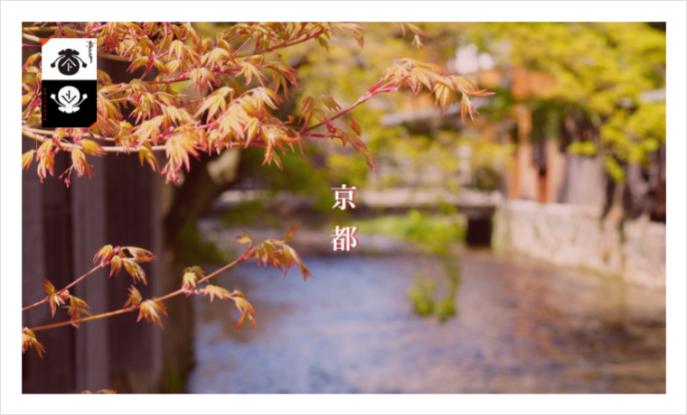
・Focus on Kyoto, the birthplace of our store.
The top page conveys the traditions of a long-established company and the appeal of its products. As shown on this site, HAKU’s top page makes full use of the following contents to create a stylish site.
- Full-size content: Full-width images with easily adjustable text placement on the image
- 3 banner content: Banners can be created with images and text
- Layered image content: Content that can display another image that fades in on top of the image
- 2-block carousel: Carousel with a choice of content to be displayed from blogs, news, and products
- Free space: Can be freely described in HTML and content width can be adjusted easily
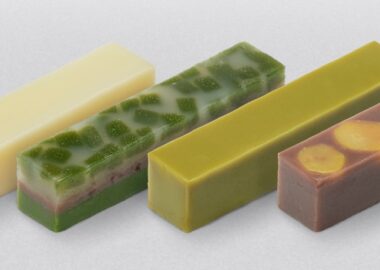
You can also use the product listing page to display selected products for branding. Please take a look at the wide variety of attractive products.
