Name: Riche Bleu Inc.
Theme: HAKU
Comment:
Riche Bleu Inc. is a sake-related product planning and sales company that uses HAKU.
The refined image of HAKU was an ideal fit for our company, so we created it with minimal customization.
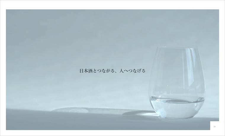
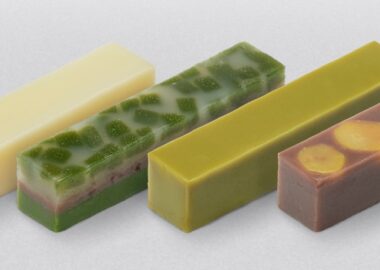
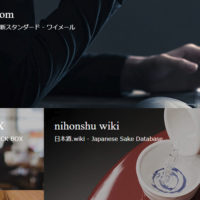
The initial part of the design highlights the sake’s transparency, while the latter cosmetic section is brighter.
As you scroll down the top page, you’ll notice the brand’s captivating storytelling approach that beautifully showcases the transparent world it represents. Sake, a key element within the cosmetics category and a symbol of Japanese culture, is presented in a highly appealing manner.
We noticed that the website maintains a good balance and consistency in terms of character count and content volume. We suggest referring to the demo site and the articles below to fine-tune this balance.
→ 6 key considerations regarding the top page layout of the TCD theme
