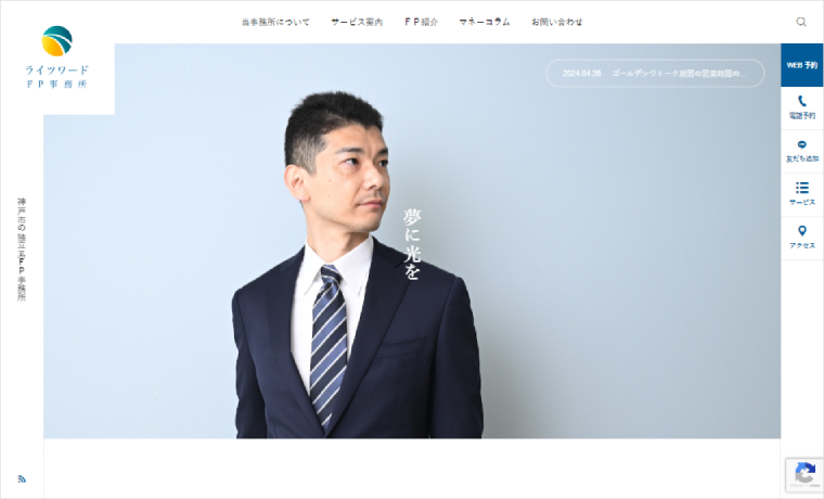
Name: Lightsword FP Office
Theme: SERUM
Comment:
“Lightsword FP Office” has adopted SERUM on their website.
Financial planners are often called the “home doctors” of money, so we thought it would be compatible with medical sites. We chose the friendly atmosphere of SERUM.
To maintain the layout of the demo site and create a sincere image, we selected a gentle blue as the site’s image color. We also chose photos that are as light blue as possible to create a unified feel for the site.
It is a clean and well-organized site. By utilizing the custom post “Medical Guide” as a “Service Guide,” each service is easy to understand and neatly organized.
>> Custom post type “Medical Information” to organize a wide variety of content
The “Image Carousel” in the footer is also useful for conveying the atmosphere of the office. The “Icon Banner” can create pathways to conversion, such as “Reservations.”
>> Footer area for galleries and multiple leads
We hope you will find it helpful as a reference for creating websites.

