Name: Cacao
Theme: TENJIKU
Comment:
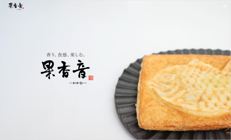
They are using TENJIKU for the website of Croissant Taiyaki “Cacao.”
– Sophisticated design and unity
– Visual appeal on the menu page
When you open the site, you’ll be struck by a single image. It has an impact that stimulates the senses, as if you can feel the texture of the croissant and smell the butter.
Also, since the entire site is unified in white, images such as headers, notification backgrounds, and footers stand out. Additionally, you can embed videos in the footer, allowing you to promote products through video as well.
Furthermore, TENJIKU uses a drawer menu, maintaining a unified design that doesn’t disrupt the site’s atmosphere.
>> In order to make the most of the atmosphere of the site, TENJIKU has adopted a drawer menu
Since Croissant Taiyaki comes in various types, please take a look at the menu page as well.

