
This is the website for Bridge Content Co., Ltd., a company specializing in planning and production of copywriting, scripts, and related content. They utilize HAKU.
We designed it using pencil illustrations and manuscript paper to convey the company’s identity as a copywriting firm with a strong sense of craftsmanship.
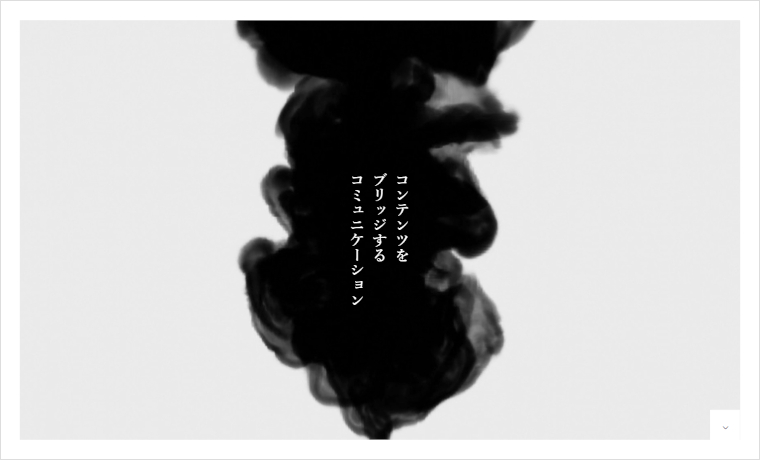
Memorable catchphrases and warm illustrations lend the entire site a sense of narrative and trustworthiness. The consistent intent in spacing and typography placement draws visitors naturally into the content.
Furthermore, the simple yet textured design makes the power of the copy and the careful expression stand out even more. This structure is also highly referenceable for those considering branding-focused website development.
For insights on balancing overall site composition and key design principles, please also refer to the following article:
>>6 Examples of Imbalanced TCD Theme Homepage Layouts
We hope you find this useful for your site development with HAKU.